How did you come to be a letter cutter?
I grew up in Cambridge and lettering was always in my life. My father was a sign writer and I remember playing with his sample board stacks instead of bricks when I was a small child. I went to Trumpington Village School and on the way to and from my home I used to sit and rest or clamber around the village war memorial. It was years later, while apprenticed to David Kindersley, that I was looking through books in his library and recognised the octagonal form and carved arches of ‘my’ war memorial and realised that it had been worked by Eric Gill. His lettering and forms must have been impressed into my brain even at that early age.
I wanted to be a painter like Stanley Spencer when I left school, having been much influenced by Ronald Neame’s film The Horse’s Mouth. It seemed to me that the eccentric and anti-social genius which Alec Guinness brought to life in his portrayal of the artist Gulley Jimson was something to aspire to! The problem was that they didn’t consider me talented enough to be a ‘real’ artist, and commercial art was not considered to be art at all, so I was advised to become an art-teacher. But I had been thrown out of my maths and French classes and had spent enough of my school time in the art room observing the ‘life of the art teacher’ to know how hard teaching kids was. Going to art school in order to become an art teacher was not going to provide the answer to my creative ambition. Then, at a time when every young successful painter seemed to have turned to abstract form, and my own work was still very figurative, I lost confidence in my ability to paint ‘modern’ things. My father was teaching an evening class in sign-writing at Cambridge Technical College, and knew that David Kindersley, who was teaching stone carving at the same college, was looking for a third apprentice. I took along a portfolio of my work to show Kindersley and was taken on immediately.
Coming to Kindersley’s workshop was like finding heaven on earth for me. Five miles outside Barton in a thatched barn with canvas partitioning there were three stone cutters all chipping away – David Parsley, Kevin Cribb, Keith Bailey. Most of our work was lettering and heraldic and relief carving for the Cambridge colleges, so I had a great grounding in high quality craftsmanship.
How did you come to settle in Norwich?
It was sheer chance. My father was a Yorkshireman and a good jazz pianist, at one stage he kept a pub on Newmarket Road in Cambridge. I had had piano lessons since the age of seven, but it was the bass which developed my life-long interest in jazz. The bass player for the pub sessions used to leave his instrument by the piano and the customers would call out ‘Come on David, play us something!’ and I always obliged! I taught myself to play jazz by listening to recordings of the great jazz piano players – Art Tatum, Bud Powell, Fats Waller and Andre Previn. I worked out the techniques by ear. Someone from one of the university jazz bands heard me playing and booked me. So I started to play jazz with various groups. I came to Norwich in 1961 and played with Pete Fenn in the Orford Jazz Cellars – Pete was Musical Director at Anglia Television at that time and he offered me some session work for ATV, which was good money. I earned as much in one afternoon session on the bass as in a week as a letter cutter! I became self-employed but contracted to David Kindersley and managed to play a couple of gigs each week as well as continuing to work in stone.
Settling in Norwich followed naturally, I was never really happy in Cambridge. I was a working class kid, and the disparity between the classes is enormous in Cambridge. I discovered Norwich – such a beautiful place, a lovely atmosphere. Everything was so well mixed, like mayonnaise compared to the oil and water of Cambridge living.
This was the time when people were leaving the countryside in droves because of the industrialisation of farming. One day, returning to Cambridge on the back roads, I discovered a Georgian house. It stood in an acre of ground and had been empty for four years. I managed to buy it with the help of a bank loan. With the security of a home of my own I gave up letter cutting and became a professional musician. I went on the road with a band called The Rainbow People, we were one of the support bands for the Beach Boys and were signed up by Pye Records (who have, incidentally, just re-released one of our tracks ‘Living in a Dream World’ on a CD called Northern Soul!). We weren’t at all bad and we made a good living without really ever becoming famous – and we had a great time.
How did you come to return to lettering?
For 15 years I had lived as a professional musician – doing pottery classes at art school when I could – but eventually I retired out of the music business in my mid-thirties and had to find a way to support myself and my Norfolk house. I started making house name-plates during the day and selling them through the Elm Hill craft shop, and I played in a dance band about six nights a week. Commissions began to come in and I spent more and more time trying to make my work more beautiful. My stone work really began to build up, with commissions coming in from architects for the buildings they were creating. Nevertheless it was four years before there were enough orders for me to be able to give up the music. For the next seven years I stayed with the lettering.
Do you consider yourself to be an artist or a craftsman?
I don’t feel I have a classification – I just like making things. Ever since my school days I have just wanted to paint or to make the things that I see around me. Where I have been lucky is in persuading society to pay for the things I like to make, whether that is my letter cutting, stone carving or playing jazz bass! If people insist on labelling me as one thing or the other they are reflecting on themselves and their own attitude to my work rather than on the nature of my creativity.
I suppose if I’m anything I’m a calligrapher, although I am hopeless with pens. We don’t get on well at all, pens and me. I am good with a brush though. With a brush in my hand I am able to respond to the situation and to draw really well.
How do you mark out the letters and designs you cut if you aren’t good with a pen?
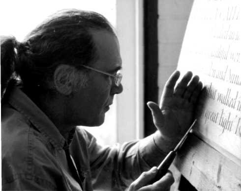
I use a brush. In David Kindersley’s workshop we didn’t use brushes but drew our letters on the material with a hard pencil. But that was because we didn’t know then how Roman and Greek inscriptions were laid out. It was only much later that I discovered the historical basis for the feeling I had about the use of brush rather than pen.
Then, quite by chance, I came across a book written by a man called Edward Catich, The Origin of the Serif. Catich was a well respected American sign writer who had gone to Italy to research incised Roman letters. His research showed that all those precise and immaculately cut inscriptions had been laid out with a brush using single strokes. The book just blew my mind away. I had never been easy with a pen, but that was the way Kindersley’s workshop had taught me to work. I was still drawing everything out. When I worked it was Kindersley’s voice that I heard, ‘My Master’s Voice’. But all the same, I could see that my letter shapes were tight – that I was ‘obeying orders’ rather than finding my own way. I knew I had to find a freedom in my work if it was to develop. It was Catich’s book which showed me the way. Nevertheless that realisation was terrifying. I knew that Chinese calligraphers, who work with the brush, begin their training at the age of seven! I bought every kind of ink, brush and paper and started practising. I would use light water colour and turn the paper over and over again to save on the cos, but I still ended up with enough lettered paper to be able to wallpaper the whole house if I had wanted to! For two years of my life every spare moment went into this practice. I had to find out for myself how it was done – there was no one being taught this time. One day I woke up and knew I had learned enough to be able to use the technique in my work.
How do you make judgements about the beauty of lettering?
It has always been understood by calligraphers and letterers that the space within and between letters is actually more important than the letters themselves. As an apprentice I watched David Kindersley and Will Carter attempting to produce a spacing system for Kindersley’s street name alphabet. They were using letters on pieces of card and trimming the card to achieve the spacing. I had always been very keen on photography and it struck me that a machine, somewhat like a photographic enlarger, could be developed to measure and quantify the values and relationships between the letters and spaces. I showed my ideas to David Kindersley who jumped at the idea, and for the next two or three years we became engrossed in research into the subject. The spacing systems we developed became the basis for the spacing system adopted by Letraset at that time and David Kindersley’s personal systems for good spacings for the rest of his life. He was criticised by some who held that spacing is an art form rather than a system. But Kindersley wasn’t trying to replace the art form, he was trying to perfect a system that would produce relatively reasonable spacing in unskilled hands. With the advent of computers and word processing it is now apparent how important such research was. One of the great sadnesses has been to see local authorities replacing Kindersley’s street signs, with their nice open letters and clear balance between the space and the letter, with something more ‘modern’ and bland.
Tell me how you came to make the beautiful piece at the King of Hearts which combines the European alphabet and the most beautiful Arabic script?

I was asked to produce a piece for an exhibition which was to tour the country for two years. This was the year that the fatwa against Salman Rushdie was declared and the horror of the fatwa really struck me, not least because I was reading Sufi stories on religious tolerance at the time. I had a friend, Ali, who was a student at Norwich School of Art, and we discussed the choice of a story which I could illustrate. We went away to read the stories of Idris Shah – Ali in Persian, and me in Latin translation. When we met later to compare notes, we found we had both chosen the same story! I struggled for weeks to find a way of giving it a visual form and was becoming more and more frustrated by the problem which seemed insurmountable. One morning I woke up and as though from a slide projector, on the wall opposite my bed I saw a shape – the main shape for the piece I made – the shape of the letters A U I S . In Arabic they mean ‘Take notice!’ or ‘Hey!’ or ‘Oi!’ etc.
The story tells how four men are arguing about how to spend the last of their money. A fifth man passes by. He is a translator – the word translator in Persian means literally ‘friend of languages’). Having listened to their argument, he says ‘Give me your money and I will make you all happy.’ He comes back with four bunches of grapes. All four men are delighted. The Sufi master (for, of course, the translator is a Sufi master) explains that although they had been unable to agree among themselves it was only because they had not understood each other – they had all been looking for the same thing though they called it by different names. The Persian had wanted angur, the Turk had wanted uzum, the Arab had asked for inab, and the Greek had demanded stafil. Everyone looks for something appropriate to each stage of their development the master told them. What they then needed was sustenance – the grapes. Later when they were ready, it would be the wine of life – which we all need.
Ali had been going to lay out the design for me, but he was away and I had to do it myself. It was then that the miracle of the letters which I had conjured up on my bedroom wall came home to me. For together the letters spell the word which means ‘Take notice’. And individually they are the initial letters of the words for grapes in the four languages in the story. It was the overall message of understanding and common need which I had wanted the piece to show. The serendipitous coming together of meaning and form enabled the telling of an old story to draw attention to a new one. So the work was made as a tribute and I hoped a comfort for Salman Rushdie at a time when his story was on everyone’s mind.